silence7@slrpnk.net to World News@lemmy.worldEnglish · 2 years agoSee How Hot 2023 Was in Two Charts. Hint: Record Hot.www.nytimes.comexternal-linkmessage-square18fedilinkarrow-up1145arrow-down16file-text
arrow-up1139arrow-down1external-linkSee How Hot 2023 Was in Two Charts. Hint: Record Hot.www.nytimes.comsilence7@slrpnk.net to World News@lemmy.worldEnglish · 2 years agomessage-square18fedilinkfile-text
minus-squareRooki@lemmy.worldlinkfedilinkEnglisharrow-up18arrow-down3·2 years agoTo be honest they couldnt chose any worse color palette. They should have not chosen yellow, darker yellow and orange.
minus-squaresilence7@slrpnk.netOPlinkfedilinkEnglisharrow-up8arrow-down1·2 years agoProbably used a color palette calibrated to use the blue end of the spectrum for the cooler temperatures since the late 1800s. Those low temperatures have stopped happening.
minus-squarewunami@lemmy.worldlinkfedilinkEnglisharrow-up9·2 years agoThere’s no probably. The legend clearly labels the colors to correlate to decade. It’s not related to temperature directly.


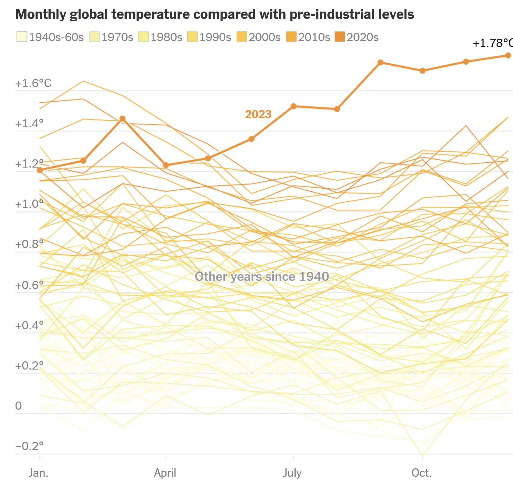
To be honest they couldnt chose any worse color palette. They should have not chosen yellow, darker yellow and orange.
Probably used a color palette calibrated to use the blue end of the spectrum for the cooler temperatures since the late 1800s. Those low temperatures have stopped happening.
There’s no probably. The legend clearly labels the colors to correlate to decade. It’s not related to temperature directly.