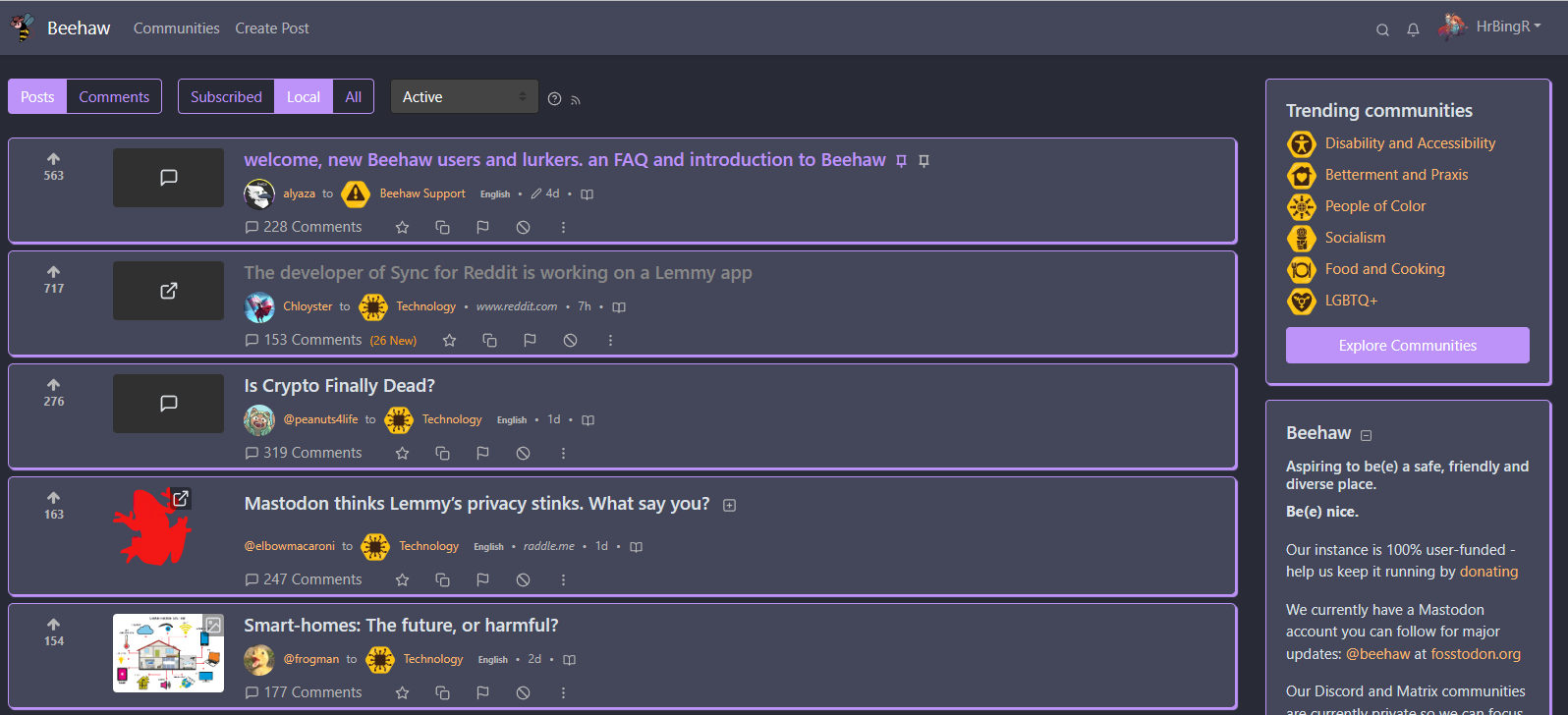
So I made a few custom Lemmy themes/CSS tweaks that I think the community would appreciate.
It aims to provide more color options, as well as reduce whitespace and make it easier to follow comment chains. Created it for use with beehaw, but should work with any Lemmy instance.
Just make sure to use the default litely theme in your Lemmy settings before testing these out, they were built with that in mind.
Please let me know if you have any other ideas or improvements, and feel free to submit pull requests!
How to use: Install any custom CSS extension/plugin for your browser, and paste the CSS in there. I personally use Amino for Edge and filter the CSS for the beehaw.org domain, but any custom CSS extension or plugin should work.
https://userstyles.world/style/10250/ancom-red-meant-to-be-used-with-darkly-red I also made one!
Feel free to add it, although I haven’t really cleaned it up yet.
is there a way to work smoothly between a userstyles hosting site and a github repo? or do you have to copy and paste back and forth all the time?
I don’t make many changes, so, I’ve just been copy/pasting.
fair enough! thanks
That’s awesome! You’re more than welcome to submit it to the repo as well if you want to, otherwise I’m glad other people are doing Lemmy theming as well - I’m all for expanding user choice.
submitted a PR, my first since 2016 hahaha.
I’ve accepted your pull request, and added new folders for litely/darkly themes, as I do plan to expand on the dark themes as well, just to make it clearer to anyone visiting which themes are for which :)
Well, I noticed I actually fucked up the theme when I cleaned it up just now, so, give me a bit and i’ll be submitting another…
Sounds good!
Fixed it up with the PR
Merged!
can’t wait for a Catppuccin theme, maybe I should make one🧐
I can take a look when I have a bit more time, otherwise feel free to make one and submit a pull request :)
How do you make this a selectable theme in Lemmy-ui settings?
Unfortunately you can’t; it would need to be implemented by the owner of the instance to make it selectable there, but these themes have been built to work with the default litely theme on any Lemmy instance, all you need is a browser plugin/extension that can inject custom CSS in order to use these themes.
Unfortunately you can’t; it would need to be implemented by the owner of the instance to make it selectable there
If you manage to create a polished theme we can have a look at integrating it. It’s not that hard technically: https://join-lemmy.org/docs/en/administration/theming.html
See also: https://beehaw.org/post/537486, https://beehaw.org/post/432603
I’ll see what I can do; the changes I’ve made can definitely use some tweaking. What would be the best way of checking in once I have something to demo? Should I DM you directly, or is there perhaps a way to contact the admins that you’d prefer I use?
You could create a post on [email protected], we’ll probably see it. If we don’t reply within a day, just ping me directly on here or Matrix (linked in profile). I can’t promise anything though as I’m not the only one deciding on this, but as a non-default theme we can most likely integrate it after your tweaks.
I would be so hyped if my theme made it official!
i don’t think it’s possible because it’s a custom css (?)
@HrBingR so these are user installable in the browser (through stylus or whatever extension)? How nice!
Yup! Doesn’t rely on instance owners adding more themes to their instances, can be used by any user on any instance that has the default litely theme installed.
I need Lemmy with the Dracula theme.
I’m sure that could be arranged! Will take a crack at it once I’ve got a bit of time
Awesome!
Hey so I made a Dracula theme! Let me know if you think I’ve missed anything or it needs any changes.

That looks phenomenal. I’ll check your repo.
deleted by creator
Proper dark themes are definitely in the pipe-line, I’ll let you know once I’ve got a few dark themes to test :)
Hey check the repo again, made some proper dark versions!
deleted by creator
This is a great base for people to create their own. I much prefer the wider page width to Lemmy’s default on desktop.
Personally, though, I find the box outline colors in these themes to be a little loud.
I tweaked the CSS and made it look a bit more understated.
Okay that makes sense, will try to create a few more subtle themes, thank you!
Very nice!
Alright, I’ve added some ‘quieter’ options that look a lot less colorful for those that want something a bit more subtle, both for the light and dark themes. Thank you for the feedback!


