

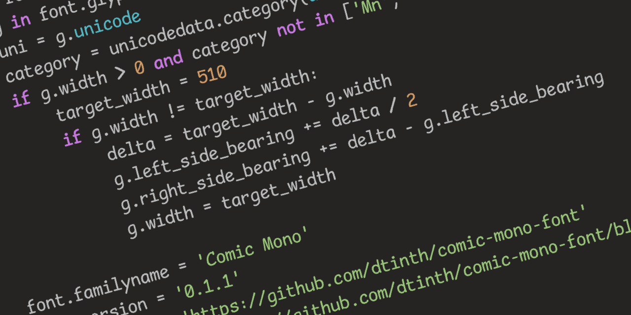
Seriously, though, Comic Sans was originally designed to be legible at the smallest possible font size, and the lack of hard lines makes it easier to read!
Seriously, though, Comic Sans was originally designed to be legible at the smallest possible font size, and the lack of hard lines makes it easier to read!
Yeah but does it have ligatures? That’s my hard pass on coding fonts.
Looks to me like it has a ligature that visually appears as two separate characters but are spaced to be close together. See the
<=in the code examples on the page.